A brand refresh was needed to be in line with Tempo's values; competent, factual and open.
At a point where Tempo was launching various new products and improving features to attract new clients, I was asked to create a style and a set of 24 illustrations. The illustration's style needed fit for marketing material as well as in-product visual aid. I also collaborated with Elias Ragnarsson, the principal designer, on Tempo's identity refresh while working with Blend, a marketing agency based in UK, to oversee the website redesign.
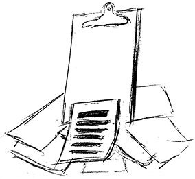
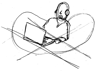

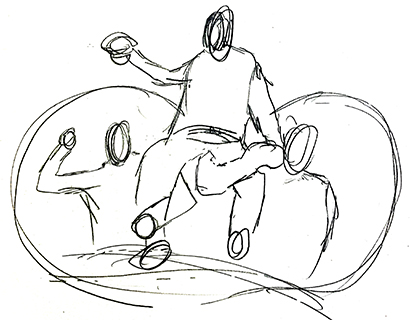


Over 24 illustrations were initially designed and more are still being added. These situational illustrations were first introduced on Tempo's website, however they soon found their way into our products as on-boarding visual aids, and into existing products to reinforce positive or negative messages.
Diversity, both gender and race, played a big factor into the colours chosen. In some instances, I used purples, teals, and coral pinks as a way to diversifying away from traditional skin colours. These 3 colours were either taken directly from our refreshed colour palette, or slightly skewed versions of it. The result of these illustrations helped promote the open aspect of Tempo's values.